Windows 11 Long-term Review: Worth Your Upgrade?
Windows 11, a fresh interface and abundance of new features
- Windows 11 has been out for some time, but should you upgrade to it?
- The new version features completely revamped user interface and many new features.
Windows 11 has been released for a while now, and most of us got the chance to test it and see how it works in action.
However, many still have second doubts regarding the Windows 11 upgrade. Therefore, today we’re going to take a closer look at Windows 11 and talk about all its new features, and maybe convince some of you to make the switch.
Can my PC run Windows 11?
The announcement of Windows 11 and the launch was followed by a lot of criticism from users due to higher Windows 11 hardware requirements. While most of the requirements are expected and can be easily met by any modern PC, the following caused the most criticism:
- CPU support – Windows 11 requires at least Intel Core Gen 8 CPU or AMD Ryzen 3000 series. For detailed requirements, check the list of supported Intel and supported AMD CPUs.
- TPM 2.0 – While most modern PCs support at least some version of TPM, version 2.0 is available only on newer motherboards/CPUs.
These two features made the initial upgrade process a lot harder than it needed to be, and many reported that Windows 11 installation failed for them or the This PC can’t run Windows 11 message.
To fix these problems, many users were forced to upgrade their hardware to try to install it again. This is one of the main reasons why many decided to stick with Windows 10 and refuse to upgrade.
Can I run Windows 11 on unsupported hardware?
Yes, Windows 11 can run on unsupported hardware, and you can easily install Windows 11 on an unsupported CPU.
The same goes for TPM and you can easily install Windows 11 without TPM. Even though you can install Windows 11 on any device, Microsoft claims that running Windows 11 on unsupported hardware can cause issues, compatibility problems, and a lack of updates.
Despite those claims, many users reported that they have been running Windows 11 on unsupported hardware for months without any issues. However, that might change someday in the future.
What’s new in Windows 11 and should I upgrade?
New Taskbar and Start Menu
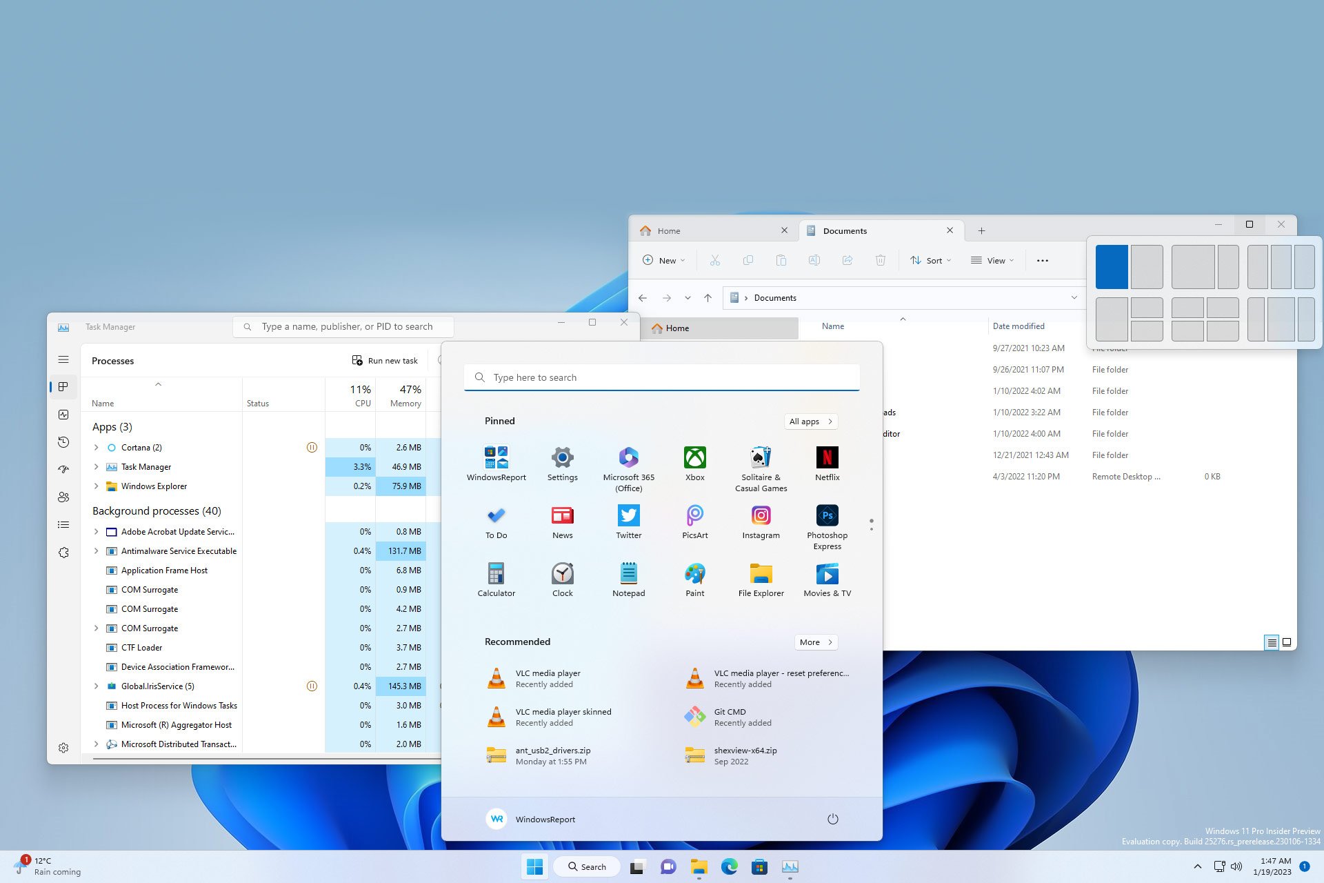
The first thing that everybody notices is the redesigned Taskbar. The Taskbar is now centered, which makes it easier to access. Of course, if you don’t prefer that, you can always position it to the left side like in previous versions of Windows.
We like the new design of Taskbar, it looks more minimalistic and cleaner than its predecessor. The old and large Search bar is now gone, and it’s replaced by a more compact Search button.

The Search button seems like an unnecessary addition and in our opinion, it takes unnecessary space on Taskbar, but you can always convert it to an icon, or hide it completely like we usually do.
The Taskbar is now locked at the bottom of the screen
If you’re one of those users that like to position the Taskbar at the top of the screen or the side, we have to inform you that’s no longer an option.
This means that Taskbar will be firmly locked at the bottom of the screen, but you can still have a vertical Taskbar on Windows 11 with third-party solutions.
We never moved Taskbar to any other location besides the bottom one on all versions of Windows that we used in the past, so we don’t mind this change, along with the majority of other users, but we realize how some users might miss this feature.
Less Taskbar options in the context menu
As for Taskbar settings, you can’t access them anymore by right-clicking the Taskbar. In previous versions, you could choose which Taskbar items you wanted to show by using the right-click menu.
This was rather convenient, but not something that’s used on regular basis, so Microsoft decided to remove it in Windows 11. All settings can now be adjusted from the Taskbar settings page in the Settings app.
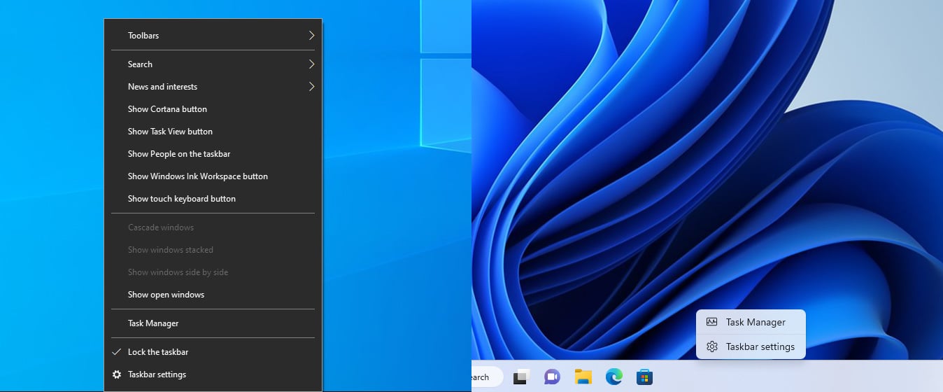
However, the ability to open Task Manager from Taskbar is still there, and since that’s one feature that we used frequently, we are glad that Microsoft decided to keep it.
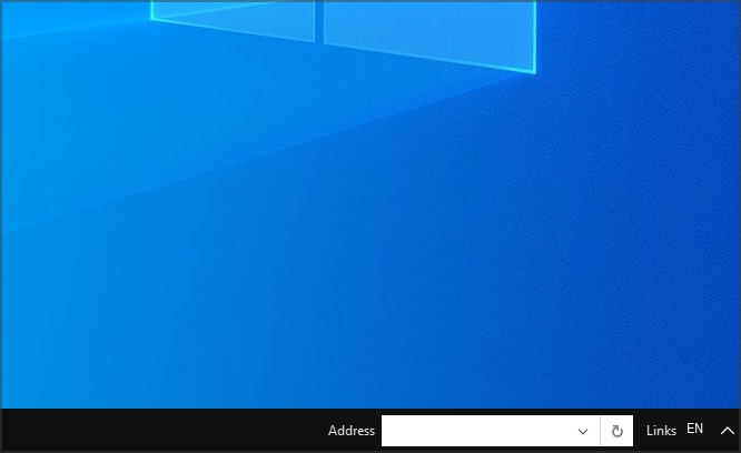
Toolbars are also gone, and you can’t add them to the Taskbar anymore. This was a feature that was present in older versions of Windows, including Windows 10.
We never used it, as we like to keep our Taskbar clutter-free, so we won’t miss this feature too much.
Revamped Start Menu
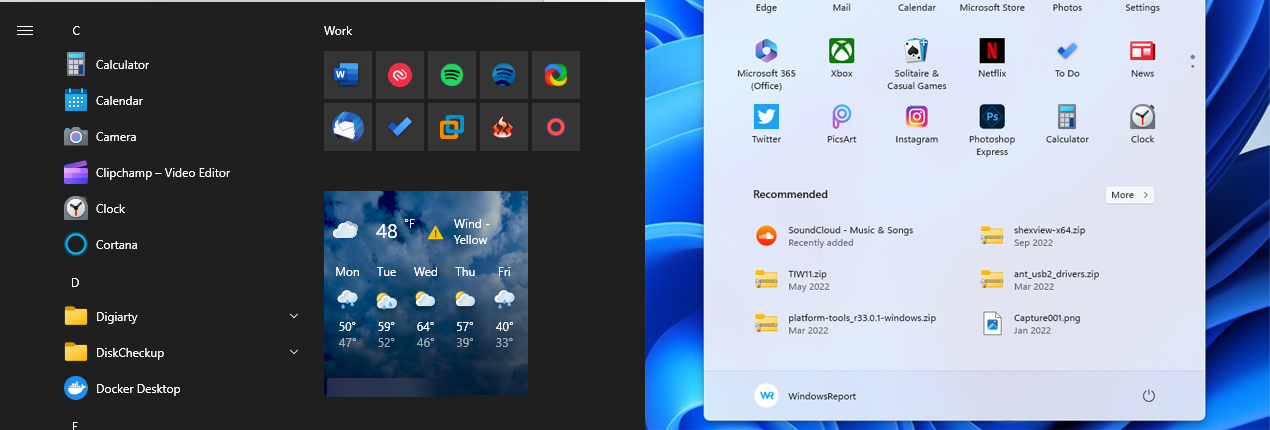
New Start Menu is completely redesigned and streamlined, so it involves less scrolling. No more will you see the list of all apps every time you open it. Instead, you’ll be greeted with a plane of pinned apps, allowing you to easily access your favorites.
Speaking of app and app pinning, be sure to visit our guide on how to pin apps in Windows 11 for more information.
Below the pinned apps is the list of recommended apps and files, and there you can see recently opened files or recently installed apps. The new Start Menu also has a Search bar on the top that you can use to search for files or folders.
However, we think that the Search bar doesn’t have a practical purpose since the search is automatically activated as soon as you start typing after opening the Start Menu or after using the Search button on the Taskbar.
We like the new design, it’s minimalistic and easy to use, and it’s an improvement over the old one in almost every regard.
However, there are a few things that we didn’t like.
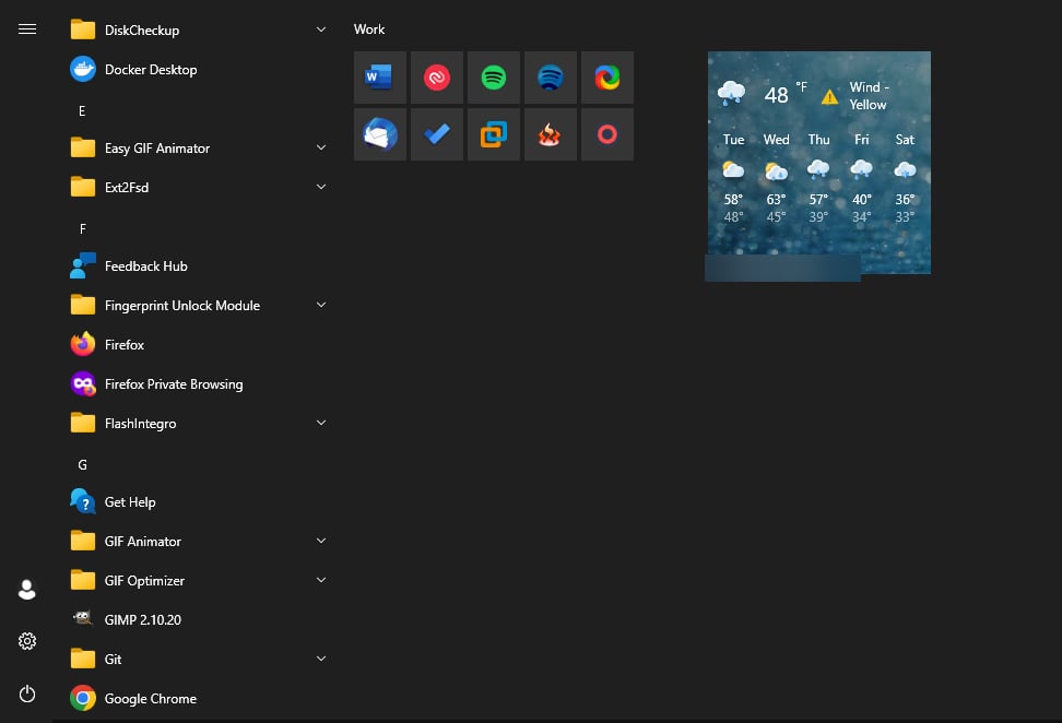
Live Tiles are gone, along with customization options
Start Menu now has fixed size
Customization options are gone in Start Menu, and no longer are you able to resize your Taskbar as you please. In Windows 10, you were able to resize the Start Menu both horizontally and vertically.
This allowed you to make it as large or as small as you wanted. Sadly, this isn’t longer possible, and the new Taskbar has fixed width and height, so you’re not able to customize its size.
Some customization options are still available, and you can read about them in our guide on Start Menu customization in Windows 11 guide.
No more Live Tiles in Start Menu
The new Start Menu, although it looks more streamlined, doesn’t have Live Tiles anymore. We used that feature regularly to check the weather or to-do lists at a glance.
However, in most cases Live Tiles didn’t offer too much useful information, and they were used as large app shortcuts, so it’s no wonder that Microsoft decided to remove them to streamline the interface.
No more groups for tiles
Groups are also gone, so you can’t group your pinned applications or Live Tiles. This was a small but useful feature since it allowed us to organize our work, entertainment, and personal apps and move them freely in the Start Menu.
Luckily, the application folders feature is still there, and it works almost the same. To create an app folder, simply move the pinned app over to another app and both of them will be added to a single folder. Of course, you can name and move the app folders as you wish.
When it comes to the design, app groups on Windows 10 will expand the group downward thus moving all elements that are below it further down. This can be a problem since you need to scroll to find a certain app or make your Start Menu bigger.
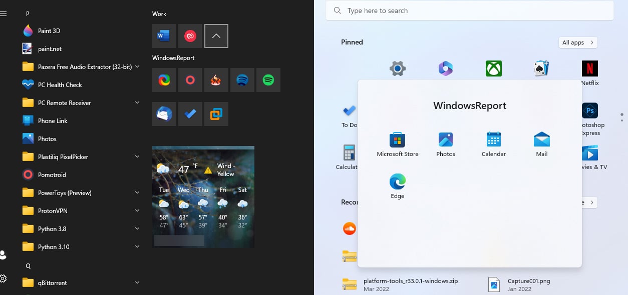
On the other hand, Windows 11 shows apps from the app folder in a separate plane, similar to your phone, which allows you to quickly access them without scrolling.
We haven’t used the app folder feature in the past that often, but we’re glad that Microsoft managed to keep it while enhancing it even further.
News, interests, and Widgets panel
Not long ago, Microsoft introduced News and interests panel in Windows 10. This feature wasn’t well received because it cluttered your Taskbar with unnecessary info, such as news and weather.
Although the weather icon can come in handy, once you open its panel you’d be swarmed with unnecessary information from preselected news sources. Most users, including us, would instantly turn this feature off and forget about it since there’s zero use for it.
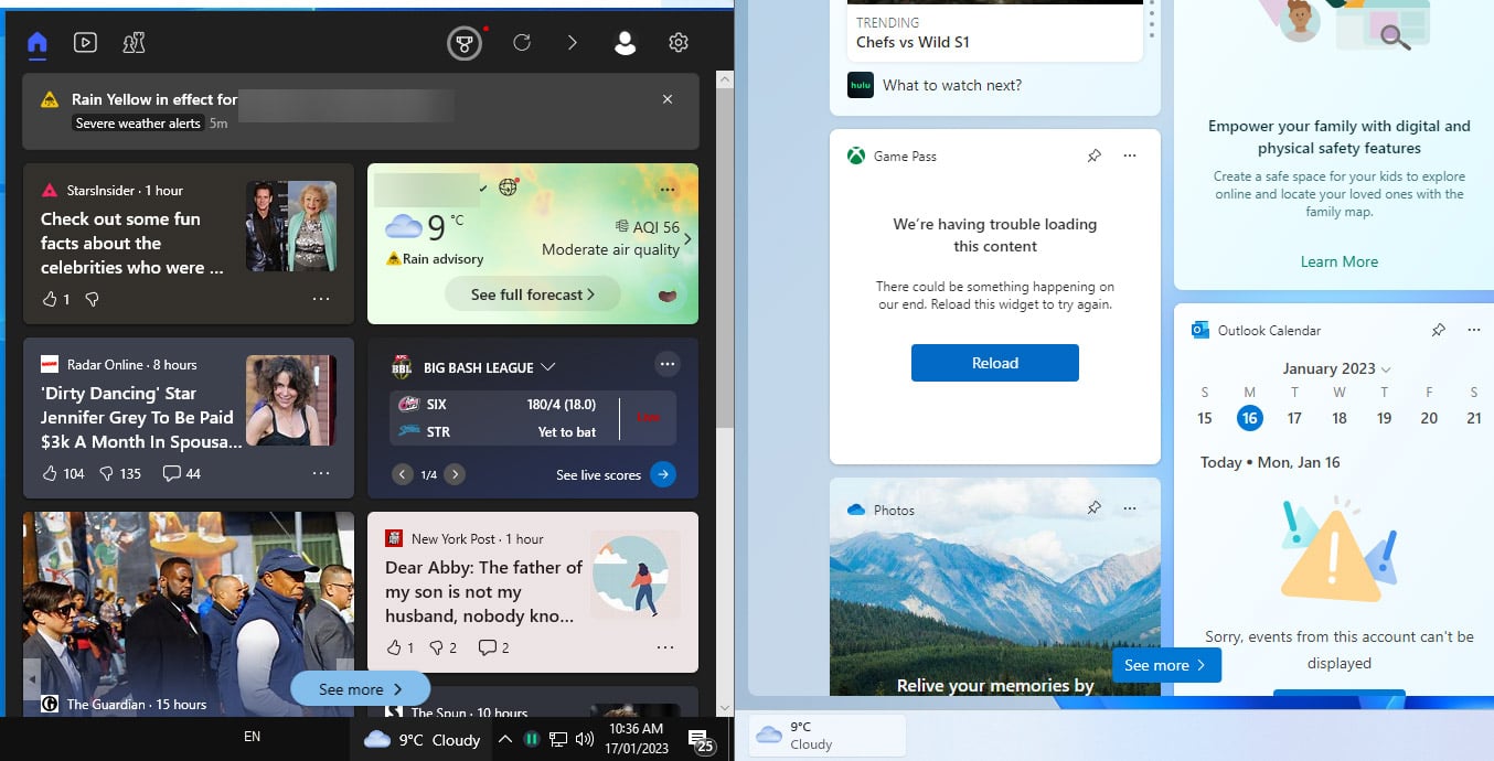
If you’re wondering how to do that, we have a special guide on how to remove Microsoft News from the Taskbar in Windows.
Widgets in Windows 11 – New design, same problems
Microsoft decided to keep this feature and rework it a bit. Now, this feature is called Widgets, and it sits in the bottom left corner showing the current weather.
The redesign looks much better, but again, you’re still swarmed with news from sources you didn’t manually pick. In the end, the feature seems unnecessary as it was on Windows 10.
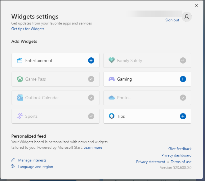
However, one small difference makes it stand out from its predecessor. The Widgets panel supports widgets, and you can move them or resize them and view useful information, similar to Live Tiles.
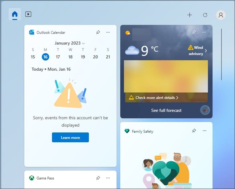
This includes your calendar, weather, to-do lists, and more. However, the choice of available widgets is rather limited, and currently, there are only 12 widgets. For this feature to be useful, we expect Microsoft to add more widgets, including ones from third-party sources in the future.
The Widgets panel in its current form leaves much to be desired, but it’s a step in the right direction when compared to its predecessor. However, we wish that the Widgets panel would be an exclusive panel for widgets and not an unsolicited news feed.
If you don’t plan to use this feature, you can always disable Widgets in Windows 11 from the Settings app.
System tray changes
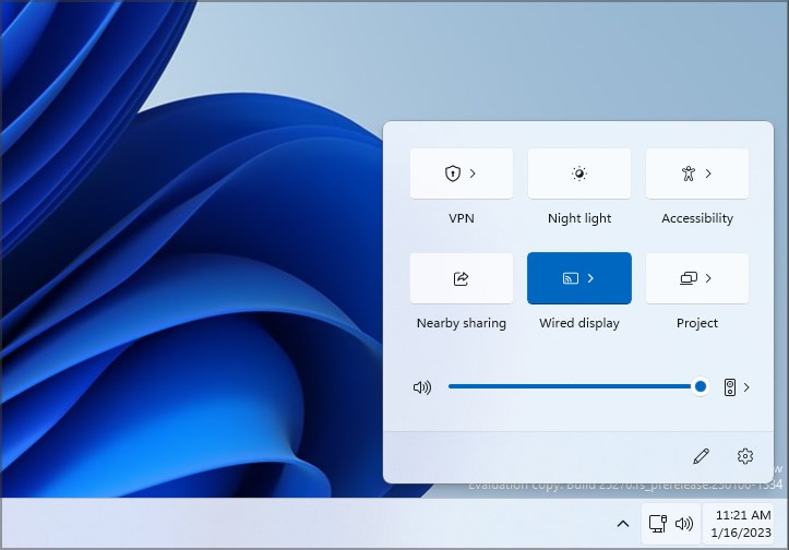
The new system tray is redesigned and you’ll notice that sound and network icons are combined into one. This also means that you can’t hide them anymore from the system tray as you could in Windows 10.
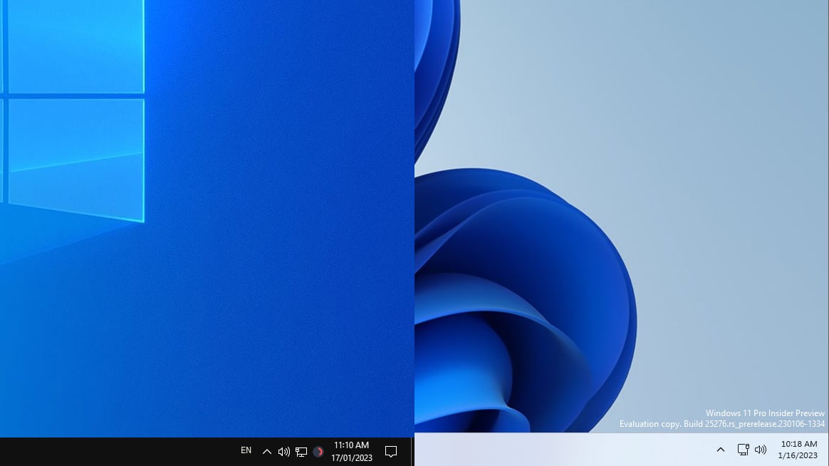
The same goes for the clock, so you’ll have to keep those icons on your screen at all times. This isn’t such a dealbreaker for us, since they provide useful information, but some users might miss the customization option.
Volume Mixer is moved to the Settings app
Speaking of missing features, the sound mixer is gone from the system tray. This means that you can only adjust the sound level of the entire system and not for individual apps like in Windows 10.
Now when you click the sound icon and choose the volume mixer option, you’ll be directed to the sound settings page, and you’ll be able to adjust sound levels for individual apps from there.

To learn more about this feature, we suggest reading our guide on how to set app volume in Windows 11.
This is a step back from Windows 10 and its volume mixer that was easily accessible from the system tray. On the bright side, you can use your mouse scroll wheel on the volume icon to quickly adjust your volume.
There are a few workarounds you can use on Windows 11. For example, Game Bar allows you to adjust the volume levels for individual apps easily, with a single keyboard shortcut.
If you’re looking for a traditional volume mixer, then we suggest using EarTrumpet software on Windows 11.
We understand that Microsoft is trying to create a more consistent design with this change, but moving the volume mixer seems like a step back in our opinion.
Revamped Action Center
In Windows 10, Action Center combines quick settings along with your notifications, and it has a dedicated icon in the system tray for quick access.
In Windows 11, things are slightly different and the Action Center now combines your notifications and calendar into one, while settings are located in a different section.
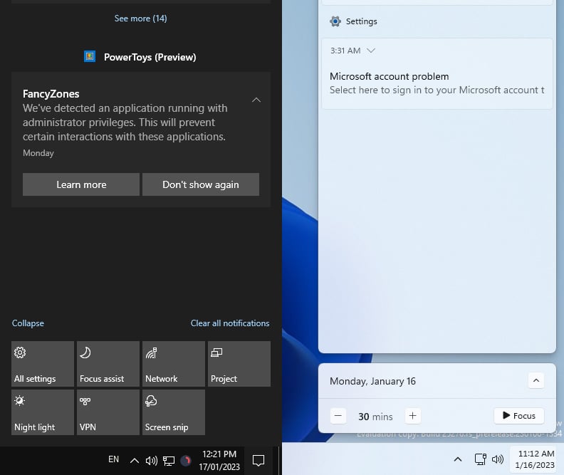
There’s also an option to start a focus session right from the calendar, but we didn’t find too much use for it. One thing that you’ll notice is that quick settings are gone from the Action Center in Windows 11.
Quick settings are now at a different location
To access quick settings, you need to click the volume or network icon. After doing that, you’ll be able to adjust the volume or toggle quick settings.
This menu also has playback controls, allowing you to easily control multimedia playback on your PC. If you want to change how the Action Center works, we have a great guide on how to customize Action Center in Windows 11.
Combining notifications and a calendar into a single panel might come in handy, especially after a short adjustment period. On the other, we rarely used quick settings on Windows 10, and we don’t have too much use for it on Windows 11 as well.
Context menu changes
The context menu has been revamped in Windows 11 completely, and many users aren’t happy with it. The context menu in Windows 10 has all the standard actions, and it usually doesn’t have any icons.
However, depending on the apps you have installed, actions might get added to the context menu along with their icons, and make it filled with features that you don’t use.
However, you can always customize the context menu with third-party software and remove actions that you don’t use.
New context menu is redesigned and streamlined
The new menu is completely redesigned, and each action has an icon next thus making each action stand out so it’s more easily recognized.
You’ll notice that application actions are missing, so your context menu will usually have only the essential functionality.

To reveal application features, you’ll need to select Show more options and you’ll get the same menu that is available on Windows 10.
The context menu slightly changes when you right-click an item, and you’ll get all your standard functionality, but you’ll notice that cut, copy and delete options have been replaced with icons.
This takes some time to adjust, but in the end, it streamlines the interface. As for application functionality, some applications will create their submenus for quick and easy access.
This wasn’t the case with Windows 10, and your context menu would easily get filled with all sorts of features that you don’t use that often.
While this helps keep the context smaller and easier to use, some application features aren’t easily accessible, so you’ll need an extra click to get to them.
This leads to certain inconsistencies, and we hope that Microsoft will sort that out in near future. Overall, we like the new change, because it keeps only the essential functionality in the context menu.
Fresh File Explorer user interface
File Explorer has been completely redesigned, including all the icons. In addition to icons, all windows now have rounded corners, and the new interface looks better than ever and somewhat similar to the macOS.

The new interface is refreshing and visually appealing, and it’s a major improvement over the previous version.
Tabs in File Explorer for quick navigation
Probably the biggest, and most welcome change is the addition of tabs in Windows 11. This is the first version of Windows to have tabs, and by using them you can have several directories open in a single window.
Expert tip:
SPONSORED
Some PC issues are hard to tackle, especially when it comes to missing or corrupted system files and repositories of your Windows.
Be sure to use a dedicated tool, such as Fortect, which will scan and replace your broken files with their fresh versions from its repository.
This is perfect for multitasking, and in the past, this type of functionality was available only by using file manager software.
While you can move the tabs, we did encounter some issues with organizing them. The entire process is not as snappy as on a web browser for example.
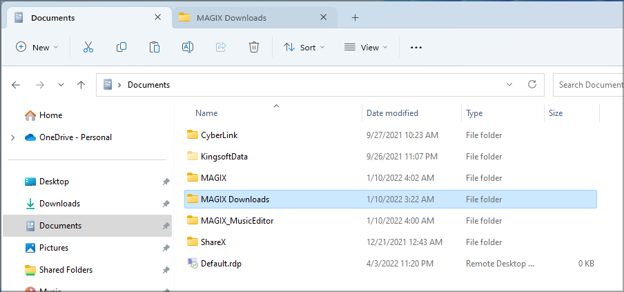
This is because you need to click and drag the tab you want to move and once the cursor is in the right position, the tabs will change places. This feels a bit different than moving a tab in your browser, and it requires a bit of exercise to master.
As for missing features, we have to mention that we miss the ability to pin tabs. This could be something incredibly useful, especially if you frequently work with specific folders.
Lastly, you can’t split tabs to create another instance in a new window. Instead, you need to manually start another instance of File Explorer which seems counterintuitive.
Overall, tabs are more than a welcome addition, and although this feature lacks some options, it’s a welcome addition to Windows.
The ribbon menu is gone from File Explorer
Ribbons are gone in Windows 11, and instead, we got a single toolbar with all the common actions.
While the single toolbar takes up less space than ribbons, and it has all of its contents in a single place, it can’t be minimized like the ribbon menu.

We rarely used the Ribbon menu on Windows 10, and therefore we kept it minimized most of the time, so this change doesn’t affect users like us.
While the new toolbar looks great and it declutters the old menu, we don’t have too much use for it and we’d like to see an option to minimize or hide the toolbar menu when not needed to get more workspace.
Snap layouts for better window management
Another addition to Windows 11 is the improved layout system. In Windows 10, you can snap windows to a quarter or a half of your screen. This is an incredibly useful productivity feature, and we use it on daily basis.
This feature works the same in Windows 11, but with a set of additional layouts. Now you just need to hover the maximize button of any window and you’ll get to choose between six different layouts.
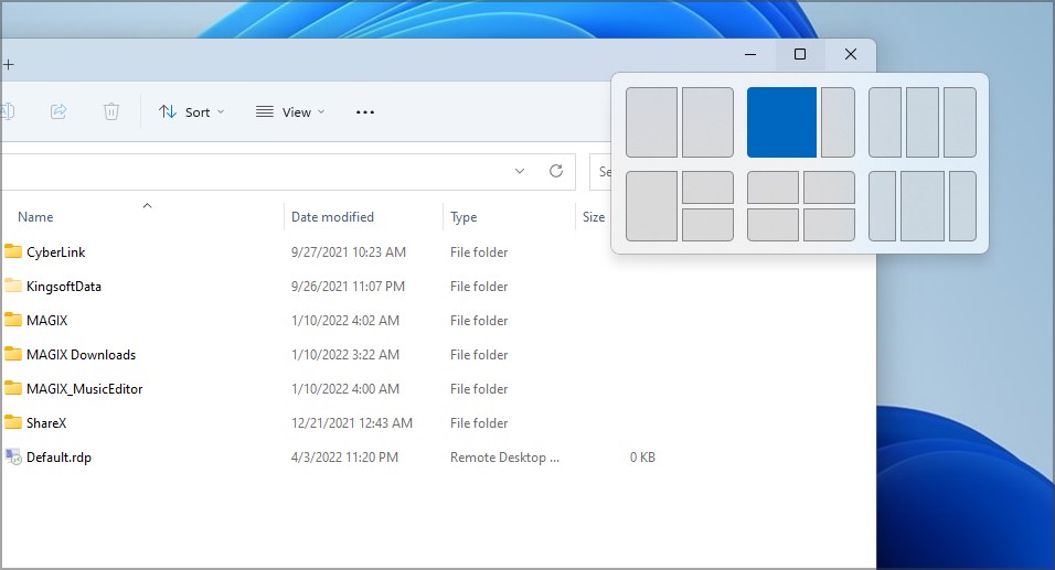
After that, just pick the section of the layout that you want to position the current window in and that’s it. Next, you need to select which window will take the remaining position and that’s it.
Alternatively, you can just take the window and drag it to the top of the screen and choose the desired layout from there.
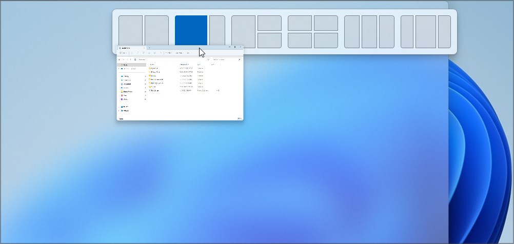
To learn more about this feature, be sure to check our guide on how to use Snap layouts on Windows 11.
This was a great feature in Windows 10, and Windows 11 made it even better. While additional layouts are great to have, some layouts might make your workspace a bit crowded unless you’re using a high-resolution or ultra-wide monitor.
If you aren’t a fan of this feature, you can always disable Snap layouts from the Settings app.
Switch between layouts quickly with Snap groups
It’s important to mention that by using layouts you’ll create Snap groups that you can quickly access from the Alt-Tab menu or your Taskbar.
This is incredibly useful for multitasking if you already have several apps added to your layouts. With this option, you’ll restore all apps to their predefined positions with a single click.
As a result, you can have one or more Snap layouts and switch between them as fast as you switch between apps. Although this feature is useful, we didn’t spend too much time with it.
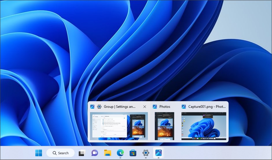
While having Snap groups is useful, switching between them requires a bit of practice. In addition, creating a Snap group will add another option in the Taskbar when you hover over an app, so you might get the feeling that your Taskbar is cluttered at times.
Lastly, it’s not simple to minimize all windows that belong to a group, and your only option is to right-click the group in the Taskbar and then choose the minimize option.
Although this feature seems interesting, and it will surely help many users, we just couldn’t get used to it, so we ended up not using it on our PC.
Revamped Settings app
The settings app has been completely revamped in Windows 11 and now it comes with a set of new and colorful icons and a two-pane easy to navigate interface.
All categories are available in the left pane, so you can access them quickly at any time. The right pane is reserved for your settings, allowing you to change them quickly.

The new Settings app looks great, it’s easier to use and the new interface feels less flat with the addition of colorful icons, so this is a great design choice by Microsoft.
To learn more about it, you should visit our dedicated guide on the new Settings app in Windows 11.
Improvements to Microsoft Store
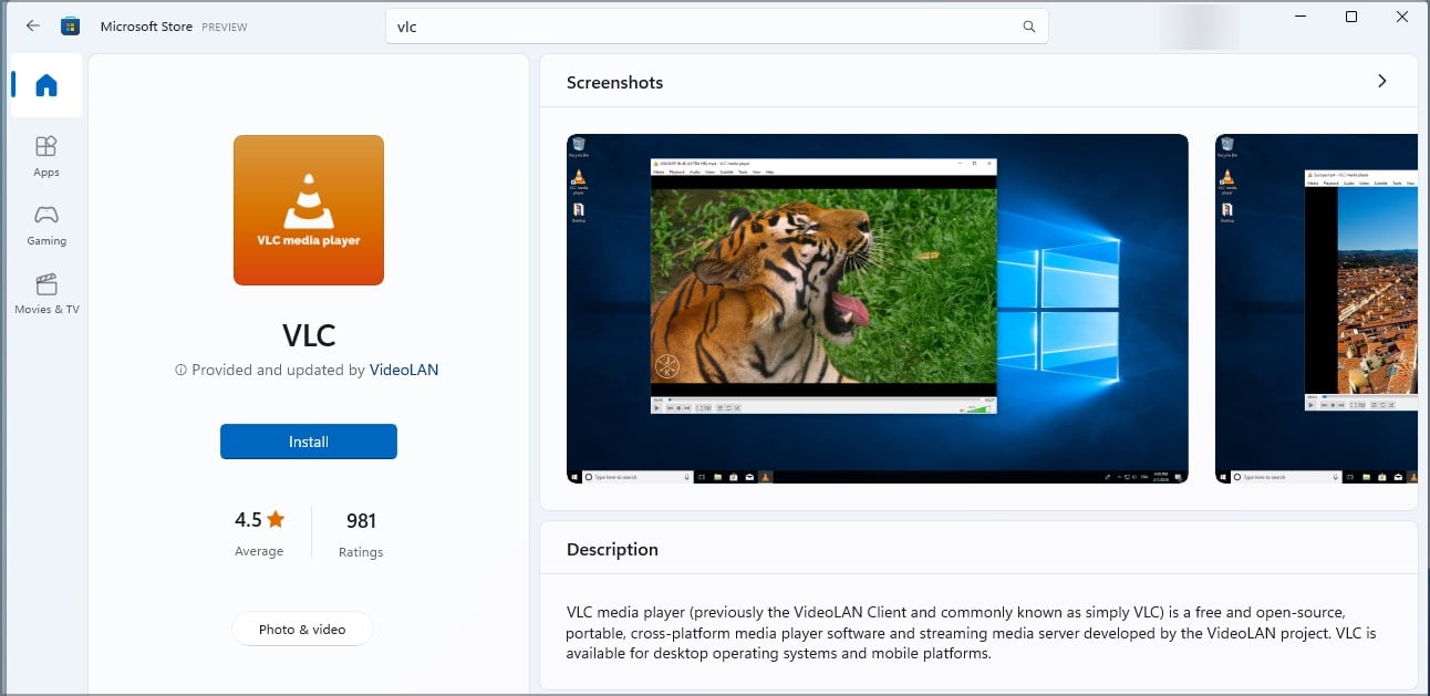
We already covered the new Microsoft Store in Windows 11 in one of our previous guides, so we’ll keep this brief.
The Store has been improved and revamped and it features a new design. If you’re on Windows 10, you probably noticed the changes in your app as well.
The new interface is cleaner, and all content is divided into several categories which makes finding it a lot faster. While visual changes are more than welcome, the biggest change is related to the list of available apps.
Win32 apps are now available in Microsoft Store
Windows Store now features Win32 apps, the same ones that you download and install manually on your PC. With the new version of Windows Store, you can get those apps from the Store.
The install process is the same as for any other regular app, just click the Install button and wait for the process to finish in the background.
Universal apps didn’t achieve any massive success in the past, and in our humble opinion, there’s just a handful of applications that can be used instead of their Win32 counterparts.
This is why the inclusion of Win32 apps in the Microsoft Store is a great step in the right direction, and hopefully, it will help make Microsoft Store a centralized app distribution for Windows in near future.
Do keep in mind that not all Win32 apps are available in the Windows Store, but you should be able to find and download most apps with ease.
Windows Terminal – One command line tool to rule them all
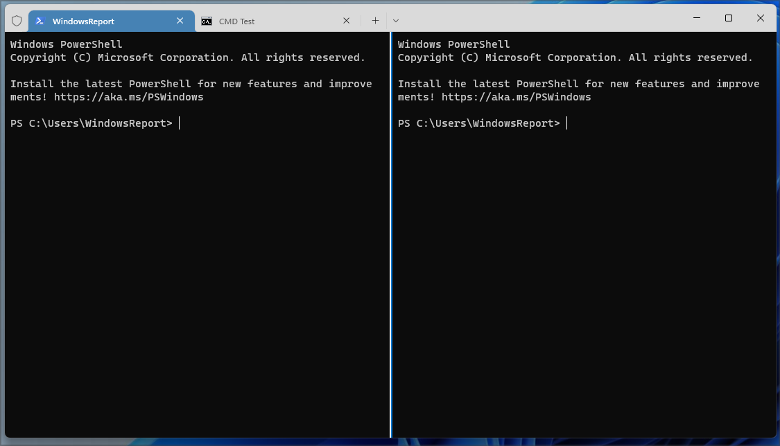
Microsoft has been working on a new command line tool called Windows Terminal, and the software is available for download from the Windows Store. Although you can download and use it manually, it’s the default command line software on Windows 11.
With Terminal, you can run any shell that you have on your PC, including PowerShell, Command Prompt, or any other. You can also set a default Terminal in Windows 11 and open it every time you start the app.
The application is customizable, and you can download Terminal themes with ease. The Terminal also has tabs, so you can have multiple shells running side by side.
You can even split a tab and have two or more instances of a single shell running in one tab. Each tab is customizable and you can change its name or color to differentiate it more easily.
Unfortunately, you can’t rearrange tabs or create a new window out of a current tab, but we hope that Microsoft will address that soon.
Windows Terminal is a great improvement, and if you’re a developer or an advanced user that frequently uses the command line, be sure to give the new Terminal a try.
Native support for Android apps
This is probably one of the biggest improvements on Windows 11, the ability to run Android apps natively.
This means that no longer will you have to rely on Android emulators. To learn more, we suggest reading our guide on Windows 11 vs Android emulators.
Unfortunately, we weren’t able to test this feature on our machine since it didn’t meet the hardware requirements.
As you probably know, this feature is brought by Android Subsystem for Windows and its biggest limitation is the reliance on Amazon App Store for app distribution.
Amazon offers fewer apps than the Play Store, so there’s a chance that you won’t be able to find every app that you’re looking for.
According to Statista’s data leading app stores, in the third quarter of 2022, Google Play had 3553050 available apps, while Amazon had barely 483328. That’s almost 9 times more apps on the Play Store, so it’s no wonder that users aren’t happy with the reliance on Amazon Appstore in Windows 11.
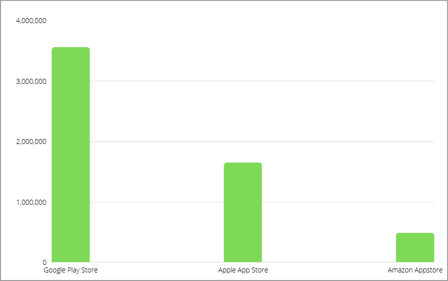
However, users have managed to find a workaround for this issue. With a bit of tweaking, you can run Google Play Store on Windows 11 with ease.
If you aren’t able to do that, you can also sideload Android apps and install APK files on Windows 11.
Other redesigned apps and improvements
Windows 11 also brings many other features that we didn’t get to cover. Many apps got a facelift, most notably the Photos app. The biggest change besides the new design is the ability to see thumbnails of all pictures that are in the same folder while viewing an image.
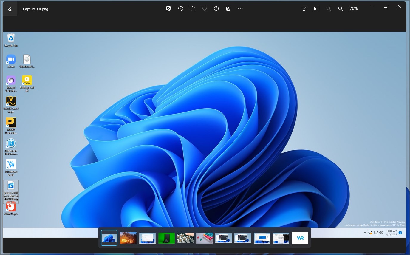
This makes finding the desired picture faster and simpler than ever before. To learn more, we suggest reading our guide on the new Photos app in Windows 11.
In addition to the Photos app, the new Notepad app has been released as well, and it brings redesigned and minimalistic interface, and it looks better than ever.
Task Manager is revamped as well, and instead of tabs on the top like in Windows 10, now it has a hamburger menu on the left. To top it off, there’s a search bar on the top that you can use to quickly find any app or process.

Windows 11 also has its voice typing tool, and if you want to learn more, we suggest reading our guide on how to use Voice Typing in Windows 11.
For multimedia enjoyers, we’re pleased to inform you that Windows 11 got a new media player. The new design features a hamburger menu for navigation thus making the interface sleek and easy to use.
All the standard features are there and you can create your video or audio library, and manage playlists and your queue. We didn’t get much time with this app, but it keeps the essential functionality while providing a fresh and minimalistic design.
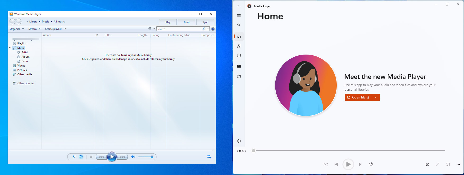
If you’re a Windows 10 user, you’ll be pleased to hear that the new Media Player is coming to Windows 10 as well.
Skype is replaced by Microsoft Teams
Another addition to the Windows 11 is Microsoft Teams. The app is now integrated into Windows and it allows you to communicate with your team or friends more easily.
For more information, visit our guide on how to use Microsoft Teams in Windows 11. We were never fans of Microsoft Teams since not many people in our circles use it for communication or collaboration.
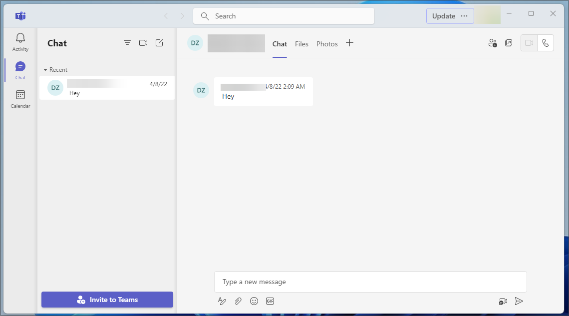
But what about Skype you may ask? Skype is gone, and Microsoft Teams is its replacement. If you want to know which client is better, we have an extensive guide on Microsoft Teams vs Skype that you should check out.
Of course, you can still get Skype in Windows 11, but it doesn’t come preinstalled anymore, and that’s no surprise since users are moving to different messaging platforms.
Cortana, OneNote, and Internet Explorer are gone
Lastly, Windows 11 removed certain features, such as Cortana, OneNote, Internet Explorer, and several others.
However, you can still use OneNote on Windows 11, even though it doesn’t come preinstalled anymore. The same applies to Cortana, and you can manually enable it any time you want.
As for Internet Explorer, you can still install Internet Explorer on Windows 11 if you need it. We never used any of these features on Windows 10, and we probably aren’t the only ones, so it’s no wonder that Microsoft decided to remove them.
Windows 11 also brings gaming improvements, and we covered them in depth in our best Windows 11 edition for gaming guide.
Conclusion
Windows 11 offers great features, and the new user interface looks fresh and visually appealing. Regarding the performance, we examined them in-depth in our Windows 11 vs Windows 10 performance guide, so be sure to check it out to see how both versions compare.
Also, be sure to use the best performance settings for Windows 11 if you want to make Windows 11 faster.
Windows 11 has a few minor issues, but that comes to personal preference. For example, we found new Snap groups sometimes a bit cumbersome to use, and tabs in File Explorer could use additional polishing.
The removal of the standard volume mixer is also another minor complaint, but that might be fixed in the future.
Another problem is the way Windows 11 handles default apps and file associations. This process is a lot more complicated than in Windows 10 since you need to set associations for each file type manually.
For more information regarding this, visit our how to set default apps in Windows 11 guide.
Overall, Windows 11 is a great operating system, it looks and works great for the most part, and those minor issues will hopefully be fixed in upcoming releases.
What are your thoughts on Windows 11? Let us know in the comments section below.
Still experiencing issues?
SPONSORED
If the above suggestions have not solved your problem, your computer may experience more severe Windows troubles. We suggest choosing an all-in-one solution like Fortect to fix problems efficiently. After installation, just click the View&Fix button and then press Start Repair.
